摘要
Matplotlib 是一个 Python 的 2D绘图库,它以各种硬拷贝格式和跨平台的交互式环境生成出版质量级别的图形。
通俗地说,matplotlib 可能是数据分析中最常用的绘图Python包了。它可以对Python中的数据进行快速的可视化,并以多种格式输出。接下来,我们将以互动的方式介绍matplotlib中的大多数情况
本文基于Jupiter notebook 环境下进行举例介绍,先导入使用到的python模块
1
2
3
4
import pandas as pdimport numpy as npimport matplotlib.pyplot as plt%matplotlib inline
先从一维数组和二维数组来简单认识一下Matplotlib
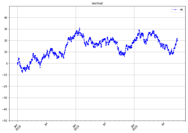
借助numpy 模块构建一个一维数组,并生成折线图
1 2 3 4 5 6 7 8 9 10 11 12 13 14 15 16 17 18 19 20 21 22 23 24 25 26 27 28 29 30 31 32 33 34 35 36 37 38 ts = pd.Series(np.random.randn(1000 ),index=pd.date_range('1/1/2018' ,periods=1000 )) ts = ts.cumsum() ts.plot( kind = 'line' , label = 'nb' , style = '--g.' , color = 'b' , alpha = 0.6 , grid = True , use_index = True , rot = 45 , ylim = [-50 ,50 ], yticks = list (range (-50 ,50 ,10 )), figsize = (12 ,8 ), title = 'normal' , legend = True )
<matplotlib.axes._subplots.AxesSubplot at 0x19d3c90>
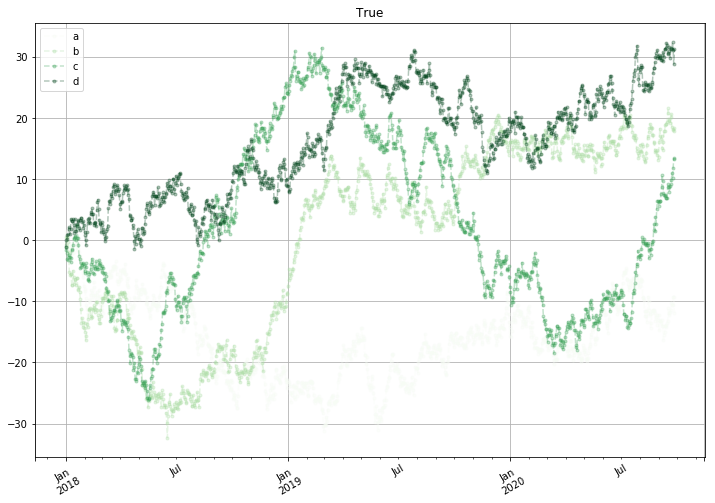
1 2 3 4 5 6 7 8 9 10 11 12 13 14 15 16 17 18 19 20 df = pd.DataFrame(np.random.randn(1000 ,4 ),index=ts.index,columns=list ('abcd' )) df = df.cumsum() df.plot(kind = 'line' , style = '--.' , grid = True , alpha = 0.3 , use_index = True , rot = 30 , figsize = (12 ,8 ), title = True , legend = True , subplots = False , colormap = 'Greens' )
<matplotlib.axes._subplots.AxesSubplot at 0xd2cc490>
下面介绍matplotlib 在数据分析中的一些常用图表的绘制以及参数设置
plt.plot(kind = ‘bar/barh’) / plt.bar()
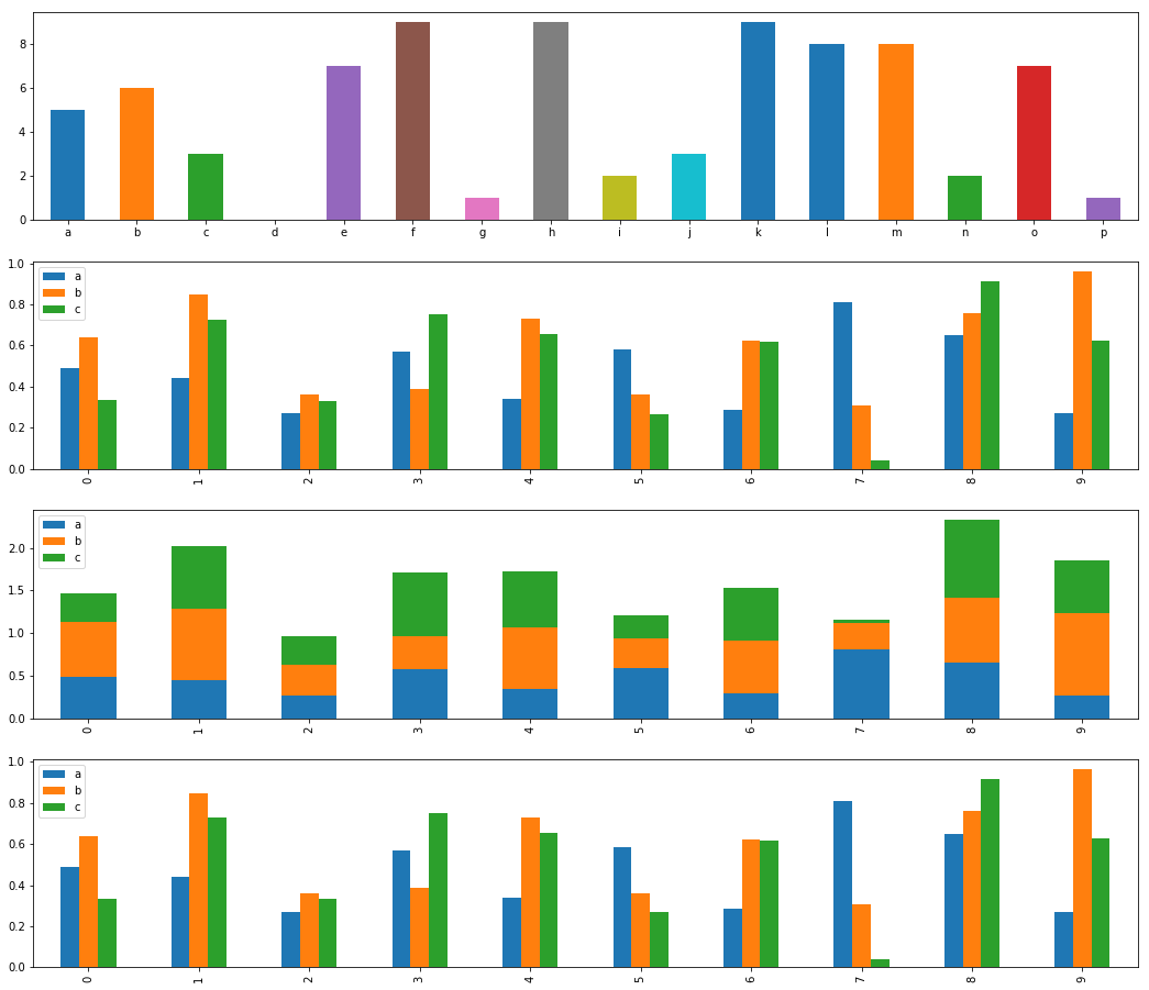
1 2 3 4 5 6 7 8 9 10 11 12 13 14 15 16 17 18 19 20 21 22 23 fig,axes = plt.subplots(4 ,1 ,figsize = (18 ,16 )) s = pd.Series(np.random.randint(0 ,10 ,16 ),index=list ('abcdefghijklmnop' )) df = pd.DataFrame(np.random.rand(10 ,3 ),columns=['a' ,'b' ,'c' ]) s.plot(kind = 'bar' ,ax = axes[0 ], rot = 0 ) df.plot(kind = 'bar' ,ax = axes[1 ]) df.plot(kind = 'bar' ,stacked = True ,ax = axes[2 ]) df.plot.bar(ax = axes[3 ])
<matplotlib.axes._subplots.AxesSubplot at 0x14008550>
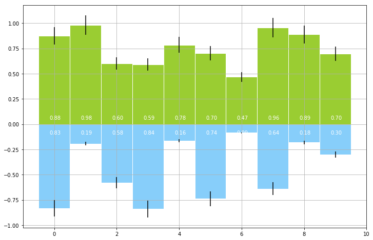
1
2
3
4
5
6
7
8
9
10
11
12
13
14
15
16
17
18
19
20
21
22
23
24
plt.figure(figsize = (12 ,8 )) x = np.arange(10 ) y1 = np.random.rand(10 ) y2 = -np.random.rand(10 ) plt.bar(x,y1,width = 1 ,facecolor = 'yellowgreen' ,edgecolor = 'white' ,yerr = y1*0.1 ) plt.bar(x,y2,width = 1 ,facecolor = 'lightskyblue' ,edgecolor = 'white' ,yerr = y2*0.1 ) plt.grid() for i,j in zip (x,y1): plt.text(i-0.15 ,0.05 ,'%.2f' % j ,color = 'white' ) for i,j in zip (x,y2): plt.text(i-0.15 ,-0.1 ,'%.2f' % -j ,color = 'white' )
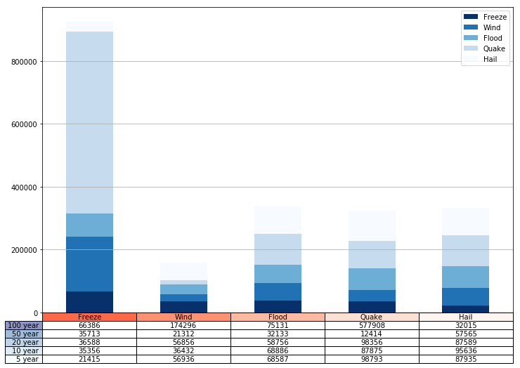
图与表的结合,能更全面的展示数据,在展示了数据的可读性的同时,也具备了
1 2 3 4 5 6 7 8 9 10 11 12 13 14 15 16 17 18 19 20 21 22 23 24 25 26 27 28 29 30 31 32 33 34 35 data = [[ 66386 , 174296 , 75131 , 577908 , 32015 ], [ 35713 ,21312 ,32133 ,12414 ,57565 ], [ 36588 ,56856 ,58756 ,98356 ,87589 ], [35356 ,36432 ,68886 ,87875 ,95636 ], [21415 ,56936 ,68587 ,98793 ,87935 ]] columns = ('Freeze' ,'Wind' ,'Flood' ,'Quake' ,'Hail' ) rows = ['%d year' % x for x in (100 ,50 ,20 ,10 ,5 )] df = pd.DataFrame(data,columns=columns,index=rows) print (df)df.plot(kind = 'bar' ,grid = True ,colormap = 'Blues_r' ,stacked = True ,figsize = (12 ,8 )) plt.table(cellText = data, cellLoc = 'center' , cellColours = None , rowLabels = rows, rowColours = plt.cm.BuPu(np.linspace(0 ,0.5 ,5 ))[::-1 ], colLabels = columns, colColours = plt.cm.Reds(np.linspace(0 ,0.5 ,5 ))[::-1 ], rowLoc = 'right' , loc = 'bottom' ) plt.xticks([])
          Freeze    Wind  Flood   Quake   Hail
100 year   66386  174296  75131  577908  32015
50 year    35713   21312  32133   12414  57565
20 year    36588   56856  58756   98356  87589
10 year    35356   36432  68886   87875  95636
5 year     21415   56936  68587   98793  87935

([], <a list of 0 Text xticklabel objects>)
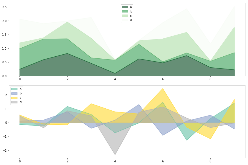
1 2 3 4 5 6 7 8 9 10 11 12 13 14 fig,axes = plt.subplots(2 ,1 ,figsize = (12 ,8 )) df1 = pd.DataFrame(np.random.rand(10 ,4 ),columns = ['a' ,'b' ,'c' ,'d' ]) df2 = pd.DataFrame(np.random.randn(10 ,4 ),columns = ['a' ,'b' ,'c' ,'d' ]) df1.plot.area(colormap = 'Greens_r' ,alpha = 0.6 ,ax = axes[0 ]) df2.plot.area(stacked = False ,colormap = 'Set2' ,alpha = 0.6 ,ax = axes[1 ])
<matplotlib.axes._subplots.AxesSubplot at 0x115591f0>
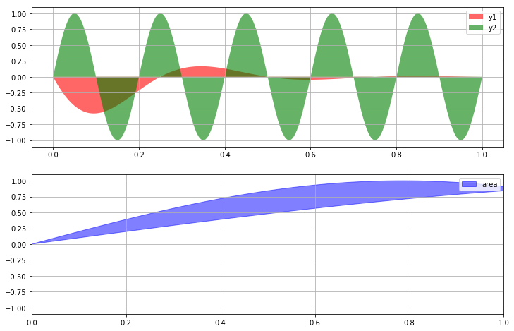
1 2 3 4 5 6 7 8 9 10 11 12 x1 = np.linspace(0 ,5 *np.pi,1000 ) y3 = np.sin(x1) y5 = np.sin(2 *x1) axes[1 ].fill_between(x1,y3,y5,color = 'b' ,alpha = 0.5 ,label = 'area' ) for i in range (2 ): axes[i].legend() axes[i].grid()
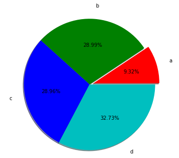
1 2 3 4 5 6 7 8 9 10 11 12 13 14 15 16 17 18 19 20 21 22 23 24 25 26 27 28 29 30 31 32 33 34 35 36 37 38 s = pd.Series(3 *np.random.rand(4 ),index=['a' ,'b' ,'c' ,'d' ],name = 'series' ) plt.axis('equal' ) plt.pie(s, explode=[0.1 ,0 ,0 ,0 ], labels = s.index, colors = ['r' ,'g' ,'b' ,'c' ], autopct='%.2f%%' , pctdistance=0.6 , labeldistance=1.2 , shadow = True , startangle=0 , radius=1.5 , frame=False ) print (s)
a    0.791267
b    2.460981
c    2.458505
d    2.777957
Name: series, dtype: float64
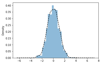
1 2 3 4 5 6 7 8 9 10 11 12 13 14 15 16 17 18 19 20 21 22 23 s = pd.Series(np.random.randn(1000 )) s.hist( bins = 20 , histtype = 'bar' , align = 'mid' , orientation = 'vertical' , alpha = 0.5 , normed = True ) s.plot(kind = 'kde' ,style = 'k--' )
<matplotlib.axes._subplots.AxesSubplot at 0x15226d10>
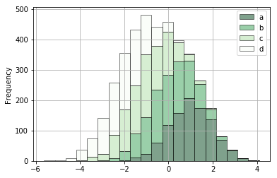
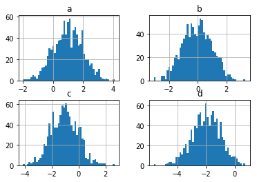
1 2 3 4 5 6 7 8 9 10 11 12 13 14 15 16 17 plt.figure(num = 1 ) df = pd.DataFrame({'a' :np.random.randn(1000 ) + 1 , 'b' :np.random.randn(1000 ), 'c' :np.random.randn(1000 ) - 1 , 'd' :np.random.randn(1000 ) - 2 }, columns=['a' ,'b' ,'c' ,'d' ]) df.plot.hist(stacked = True , bins = 20 , colormap = 'Greens_r' , alpha = 0.5 , grid = True , edgecolor = 'black' ) df.hist(bins = 50 )
array([[<matplotlib.axes._subplots.AxesSubplot object at 0x1510E290>,
        <matplotlib.axes._subplots.AxesSubplot object at 0x15745CD0>],
       [<matplotlib.axes._subplots.AxesSubplot object at 0x15761AF0>,
        <matplotlib.axes._subplots.AxesSubplot object at 0x1577CA10>]],
      dtype=object)


<Figure size 432x288 with 0 Axes>
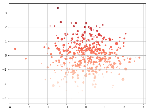
1 2 3 4 5 6 7 8 9 10 11 12 13 14 15 16 17 18 plt.figure(figsize = (8 ,6 )) x = np.random.randn(1000 ) y = np.random.randn(1000 ) plt.scatter(x,y,marker = '.' , s = np.random.randn(1000 )*100 , c = y*100 , cmap = 'Reds' , alpha = 0.8 ) plt.grid()
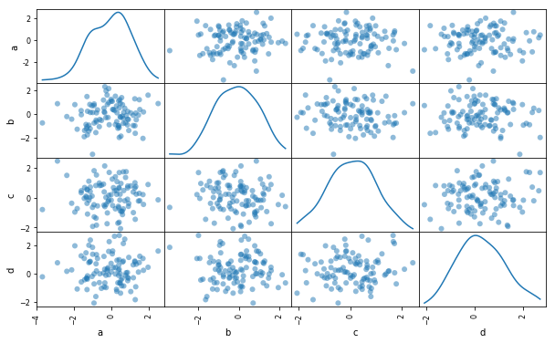
1 2 3 4 5 6 7 8 9 10 11 12 df = pd.DataFrame(np.random.randn(100 ,4 ),columns=['a' ,'b' ,'c' ,'d' ]) pd.scatter_matrix(df,figsize = (10 ,6 ), marker = 'o' , diagonal='kde' , alpha = 0.5 , range_padding=0.1 )
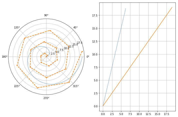
1 2 3 4 5 6 7 8 9 10 11 12 13 14 15 16 17 18 19 20 21 22 23 24 25 26 27 s = pd.Series(np.arange(20 )) theta = np.arange(0 ,2 *np.pi,0.02 ) fig = plt.figure(figsize = (12 ,8 )) ax1 = plt.subplot(121 ,projection = 'polar' ) ax2 = plt.subplot(122 ) ax1.plot(theta,theta*3 ,linestyle = '--' ,lw = 1 ) ax1.plot(s,linestyle = '--' ,marker = '.' ,lw = 2 ) ax2.plot(theta,theta*3 ,linestyle = '--' ,lw = 1 ) ax2.plot(s) plt.grid()
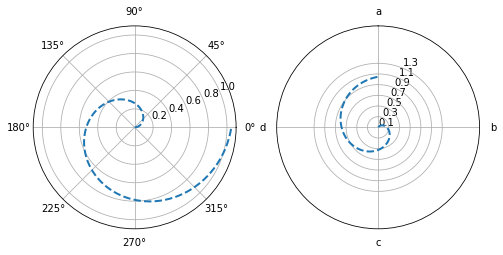
1 2 3 4 5 6 7 8 9 10 11 12 13 14 15 16 17 18 19 20 21 22 23 24 25 26 27 28 29 theta = np.arange(0 ,2 *np.pi,0.02 ) plt.figure(figsize = (8 ,4 )) ax1 = plt.subplot(121 ,projection = 'polar' ) ax2 = plt.subplot(122 ,projection = 'polar' ) ax1.plot(theta,theta/6 ,'--' ,lw = 2 ) ax2.plot(theta,theta/6 ,'--' ,lw = 2 ) ax2.set_theta_direction(-1 ) ax2.set_thetagrids(np.arange(0.0 ,360.0 ,90 ),['a' ,'b' ,'c' ,'d' ]) ax2.set_rgrids(np.arange(0.2 ,2 ,0.4 )) ax2.set_theta_offset(np.pi/2 ) ax2.set_rlim(0.2 ,1.2 ) ax2.set_rmax(2 ) ax2.set_rticks(np.arange(0.1 ,1.5 ,0.2 ))
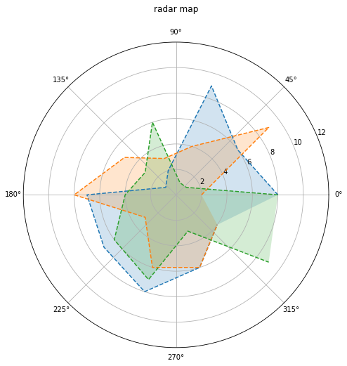
1 2 3 4 5 6 7 8 9 10 11 12 13 14 15 16 17 18 19 20 21 plt.figure(figsize = (12 ,8 )) ax1 = plt.subplot(111 ,projection = 'polar' ) ax1.set_title('radar map\n' ) ax1.set_rlim(0 ,12 ) data1 = np.random.randint(1 ,10 ,10 ) data2 = np.random.randint(1 ,10 ,10 ) data3 = np.random.randint(1 ,10 ,10 ) theta = np.arange(0 ,2 *np.pi,2 *np.pi/10 ) ax1.plot(theta,data1,'--' ,label = 'data1' ) ax1.fill(theta,data1,alpha = 0.2 ) ax1.plot(theta,data2,'--' ,label = 'data1' ) ax1.fill(theta,data2,alpha = 0.2 ) ax1.plot(theta,data3,'--' ,label = 'data1' ) ax1.fill(theta,data3,alpha = 0.2 )
[<matplotlib.patches.Polygon at 0xe585fd0>]
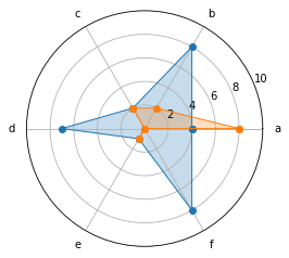
雷达图与极坐标图、填图的组合使用
1 2 3 4 5 6 7 8 9 10 11 12 13 14 15 16 17 18 19 20 21 labels = np.array(['a' ,'b' ,'c' ,'d' ,'e' ,'f' ]) dataLenth = 6 data1 = np.random.randint(0 ,10 ,6 ) data2 = np.random.randint(0 ,10 ,6 ) angles = np.linspace(0 ,2 *np.pi,dataLenth,endpoint=False ) data1 = np.concatenate((data1,[data1[0 ]])) data2 = np.concatenate((data2,[data2[0 ]])) angles = np.concatenate((angles,[angles[0 ]])) plt.polar(angles,data1,'o-' ,linewidth = 1 ) plt.fill(angles,data1,alpha = 0.25 ) plt.polar(angles,data2,'o-' ,linewidth = 1 ) plt.fill(angles,data2,alpha = 0.25 ) plt.thetagrids(angles * 180 /np.pi,labels) plt.ylim(0 ,10 )
(0, 10)
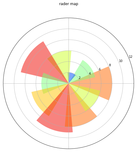
1 2 3 4 5 6 7 8 9 10 11 12 13 14 15 16 plt.figure(figsize = (12 ,8 )) ax1 = plt.subplot(111 ,projection = 'polar' ) ax1.set_title('rader map\n' ) ax1.set_rlim(0 ,12 ) data = np.random.randint(1 ,10 ,10 ) theta = np.arange(0 ,2 *np.pi,2 *np.pi/10 ) bar = ax1.bar(theta,data,alpha = 0.5 ) for r,bar in zip (data,bar): bar.set_facecolor(plt.cm.jet(r/10. )) plt.thetagrids(np.arange(0.0 ,360.0 ,90 ),[])
(<a list of 8 Line2D thetagridline objects>,
 <a list of 4 Text thetagridlabel objects>)
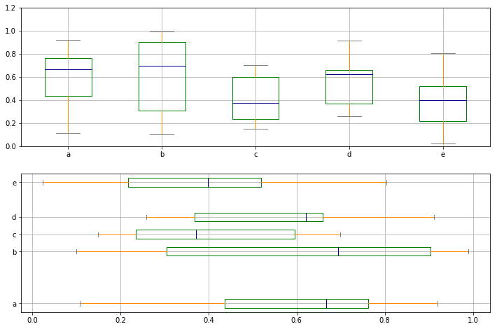
箱型图 :又称箱线图 、盒须图 ,是一种用作显示一组数据分散情况 资料的统计图
1 2 3 4 5 6 7 8 9 10 11 12 13 14 15 16 17 18 19 20 21 22 23 24 25 26 27 fig,axes = plt.subplots(2 ,1 ,figsize = (12 ,8 )) df = pd.DataFrame(np.random.rand(10 ,5 ),columns=['a' ,'b' ,'c' ,'d' ,'e' ]) color = dict (boxes = 'DarkGreen' ,whiskers = 'DarkOrange' ,medians = 'DarkBlue' , caps = 'Gray' ) df.plot.box(ylim = [0 ,1.2 ], grid = True , color = color, ax = axes[0 ]) df.plot.box(vert = False , positions = [1 ,4 ,5 ,6 ,8 ], ax = axes[1 ], grid = True , color = color)
<matplotlib.axes._subplots.AxesSubplot at 0x109bccd0>
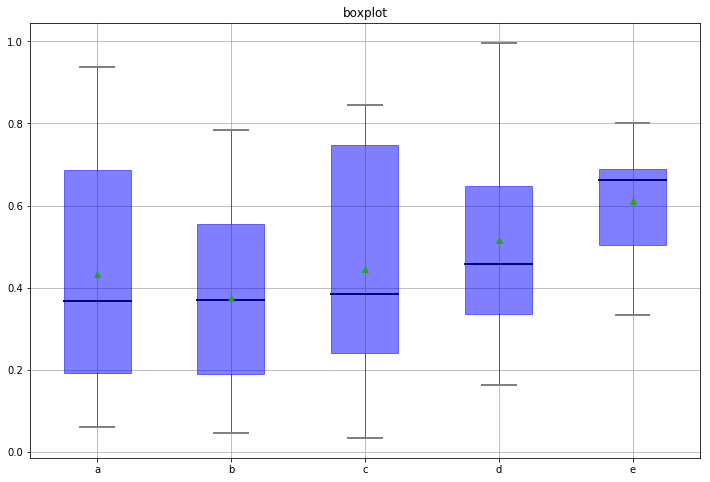
1 2 3 4 5 6 7 8 9 10 11 12 13 14 15 16 17 18 19 20 21 22 23 24 25 26 27 28 29 30 31 32 33 34 35 36 37 38 39 40 41 42 43 44 45 46 47 48 49 50 51 52 53 54 55 56 57 58 59 60 61 62 63 64 65 66 67 68 df = pd.DataFrame(np.random.rand(10 ,5 ),columns=['a' ,'b' ,'c' ,'d' ,'e' ]) plt.figure(figsize = (12 ,8 )) f = df.boxplot( sym = 'o' , vert = True , whis = 1.5 , patch_artist = True , meanline = False ,showmeans = True , showbox = True , showcaps = True , showfliers = True , notch = False , return_type = 'dict' ) plt.title('boxplot' ) print (f)for box in f['boxes' ]: box.set (color = 'b' ,linewidth = 1 ) box.set (facecolor = 'b' ,alpha = 0.5 ) for whisker in f['whiskers' ]: whisker.set (color = 'k' ,linewidth = 0.5 ,linestyle = '-' ) for cap in f['caps' ]: cap.set (color = 'gray' ,linewidth = 2 ) for median in f['medians' ]: median.set (color = 'DarkBlue' ,linewidth = 2 ) for flier in f['fliers' ]: flier.set (marker = 'o' ,color = 'y' ,alpha = 0.5 )
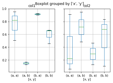
1 2 3 4 5 6 7 8 9 10 11 12 13 14 15 df = pd.DataFrame(np.random.rand(10 ,2 ),columns = ['col1' ,'col2' ]) df['x' ] = pd.Series(['a' ,'a' ,'a' ,'a' ,'a' ,'b' ,'b' ,'b' ,'b' ,'b' ]) df['y' ] = pd.Series(['a' ,'b' ,'a' ,'b' ,'a' ,'b' ,'a' ,'b' ,'a' ,'b' ]) print (df.head())df.boxplot(column = ['col1' ,'col2' ],by = ['x' ,'y' ])
       col1      col2  x  y
0  0.507773  0.223859  a  a
1  0.128340  0.482120  a  b
2  0.955340  0.912310  a  a
3  0.170645  0.949025  a  b
4  0.821798  0.059242  a  a

array([<matplotlib.axes._subplots.AxesSubplot object at 0x13B3BA30>,
       <matplotlib.axes._subplots.AxesSubplot object at 0x1115FED0>],
      dtype=object)
1 2 3 4 5 6 7 8 9 10 11 12 13 14 15 16 17 18 19 20 21 22 23 df = pd.DataFrame(np.random.randn(10 ,4 ),columns=['a' ,'b' ,'c' ,'d' ]) sty = df.style def color_neg_red (val ): if val < 0 : color = 'red' else : color = 'black' return ('color:%s' % color) df.style.applymap(color_neg_red)
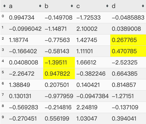
1 2 3 4 5 6 7 8 9 10 11 12 13 14 15 16 17 18 19 20 21 22 df = pd.DataFrame(np.random.randn(10 ,4 ),columns=['a' ,'b' ,'c' ,'d' ]) sty = df.style def highlight_max (s ): is_max = s == s.max () lst = [] for v in is_max: if v: lst.append('background-color: yellow' ) else : lst.append('' ) return (lst) df.style.apply(highlight_max,axis = 1 , subset = pd.IndexSlice[2 :5 ,['b' ,'d' ]])
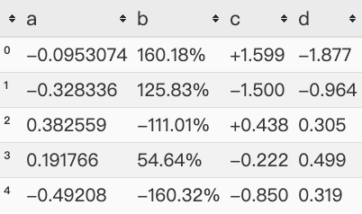
1 2 3 4 5 6 7 8 9 10 11 12 13 14 15 df = pd.DataFrame(np.random.randn(10 ,4 ),columns=['a' ,'b' ,'c' ,'d' ]) df.head().style.format ({'b' :"{:.2%}" ,'c' :"{:+.3f}" ,'d' :"{:.3f}" })
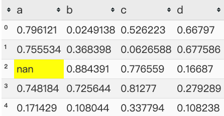
1 2 3 4 5 6 7 df = pd.DataFrame(np.random.rand(5 ,4 ),columns=list ('abcd' )) df['a' ][2 ] = np.nan df.style.highlight_null(null_color = 'yellow' )
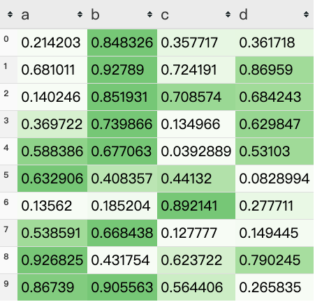
1 2 3 4 df = pd.DataFrame(np.random.rand(10 ,4 ),columns=list ('abcd' )) df.style.background_gradient(cmap = 'Greens' ,axis = 1 ,low = 0 ,high = 1 )
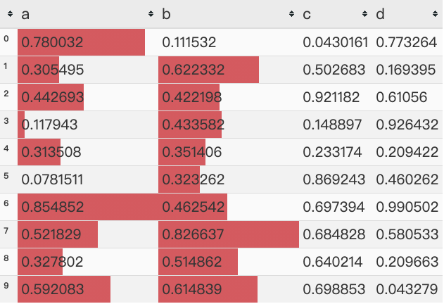
1 2 3 4 5 df = pd.DataFrame(np.random.rand(10 ,4 ),columns=list ('abcd' )) df.style.bar(subset = ['a' ,'b' ],color = '#d65f5f' ,width = 100 )
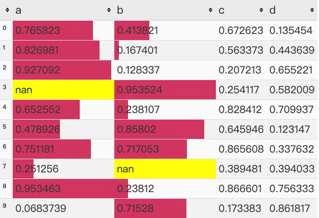
1 2 3 4 5 6 7 8 df = pd.DataFrame(np.random.rand(10 ,4 ),columns=list ('abcd' )) df['a' ][3 ] = np.nan df['b' ][7 ] = np.nan df.style.\ bar(subset = ['a' ,'b' ],color = '#d33f5f' ,width = 100 ).\ highlight_null(null_color = 'yellow' )
以上为数据分析中matplotlib库中的常用图表的绘制以及各个图表的参数说明,记录下来方便查漏补缺的同时,可供随时翻阅,有哪些地方出现错误或者疑义,欢迎讨论,感谢阅读~
本文版权归作者所有,欢迎转载,转载请注明出处和链接来源。