摘要
监督学习与非监督学习的基本认识,以及常用的几种基础算法的介绍~
前言
本文将记录下学习数据分析中几个最为常见的基本算法,先来了解一下其算法概念
监督学习
监督学习,是一个机器学习中的方法。通过已有的样本数据的样本值x和结果值y去训练得到一个最优模型,再利用这个模型将所有的输入映射为相应的输出。
根据输出数据又分为回归问题和分类问题。回归问题通常输出是一个连续的数值,分类问题的输出是几个特定的数值。
-
回归问题
概念:在统计学中,回归分析指的是确定两种或两种以上变量间相互依赖的定量关系的一种统计分析方法
按照自变量和因变量之间的关系类型,可分为线性回归分析和非线性回归分析,线性回归是监督学习中最为常用,也是最为重要的一个方法
-
分类问题
监督学习中针对分类问题最常用的算法是:最邻近分类算法,简称KNN。
核心逻辑:在距离空间里,如果一个样本的最接近的k个邻居里,绝大多数属于某个类别,则该样本也属于这个类别
非监督学习
无监督学习,是人工智能网络的一种算法。其目的是去对原始资料进行分类,以便了解资料内部结构。
简言之,就是根据未知类别的训练样本解决模式识别中的各种问题。一般来说非监督学习的训练样本全是特征量x,无结果值y;非监督学习更多时候做聚类或降维
-
PCA主成分分析
PCA主成分分析是最广泛的无监督算法,也是最基础的降维算法
通过线性变换将原始数据变换为一组各维度线性无关的表示,用于提取数据的主要特征量 → 高维数据降维
-
K—means聚类
最常用的机器学习聚类算法,且为典型的基于距离的聚类算法
K均值:基于原型的、划分的距离技术,它试图发现用户指定个数(K)的簇,以欧式距离作为相似度测度。
随机算法
蒙特卡罗算法
蒙特卡罗算法,又称随机抽样或统计实验方法,是以概率和统计理论方法为基础的一种计算方法
使用随机数(或更常见的伪随机数)来解决很多计算问题,将所求解的问题同一定的概率模型向联系,用电子计算机实现统计模拟或抽样,以获得问题的近似解
蒙特卡罗算法特点:采样越多,越近似最优解。
以下是几种常见算法的基本应用
线性回归
线性回归使用最佳的拟合直线在因变量(Y)和一个或多个自变量(X)之间建立一种关系。
简单线性回归(一元线性回归)表达式: Y = a + b * X
多元线性回归表达式:Y = a + b1 * X + b2 * X , 可根据给定的预测变量S来预测目标变量的值
tips:核心在于拟合直线与样本值的误差项满足均值为0,方差为某个特定值的正态分布
一元线性回归
1
2
3
4
5
6
|
import pandas as pd
import numpy as np
import matplotlib.pyplot as plt
%matplotlib inline
|
1
2
3
4
5
6
7
8
9
10
11
12
13
14
15
16
17
18
19
20
21
22
23
24
25
26
27
28
29
30
31
| from sklearn.linear_model import LinearRegression
rng = np.random.RandomState(1)
xtrain = 10 + rng.rand(30)
ytrain = 8 + 4 * xtrain + rng.rand(30)
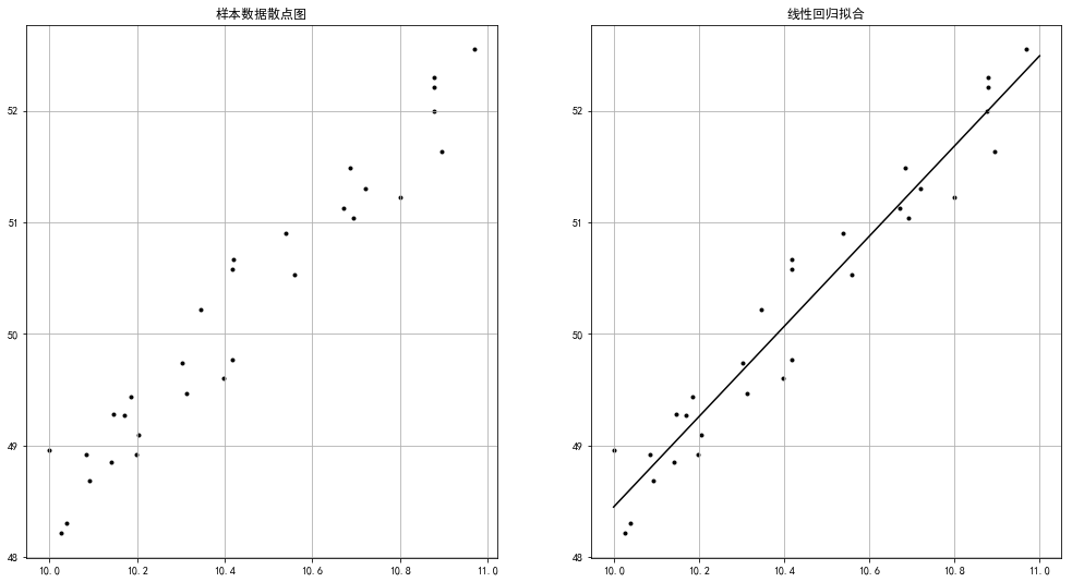
fig = plt.figure(figsize = (17,9))
ax1 = fig.add_subplot(1,2,1)
plt.scatter(xtrain,ytrain,marker = '.',color = 'k')
plt.grid()
plt.title('样本数据散点图')
model = LinearRegression()
model.fit(xtrain[:,np.newaxis],ytrain)
print(model.coef_)
print(model.intercept_)
xtest = np.linspace(10,11,1000)
ytest = model.predict(xtest[:,np.newaxis])
ax2 = fig.add_subplot(1,2,2)
plt.scatter(xtrain,ytrain,marker = '.',color = 'k')
plt.plot(xtest,ytest,color = 'k')
plt.grid()
plt.title('线性回归拟合')
|
1
2
3
| # 输出
[4.04484138]
7.9992457345747
|
1
2
3
4
5
6
7
8
9
10
11
12
13
14
15
16
17
18
19
20
21
|
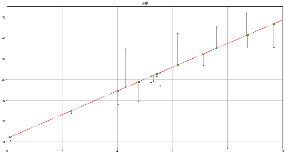
rng = np.random.RandomState(8)
xtrain = 10 * rng.rand(15)
ytrain = 8 + 4 * xtrain + rng.rand(15) * 30
model.fit(xtrain[:,np.newaxis],ytrain)
xtest = np.linspace(0,10,1000)
ytest = model.predict(xtest[:,np.newaxis])
plt.figure(figsize = (17,9))
plt.plot(xtest,ytest,color = 'r',linestyle = '--')
plt.scatter(xtrain,ytrain,marker = '.',color = 'k')
ytest2 = model.predict(xtrain[:,np.newaxis])
plt.scatter(xtrain,ytest2,marker = 'x',color = 'g')
plt.plot([xtrain,xtrain],[ytrain,ytest2],color = 'gray')
plt.grid()
plt.xlim(0,10)
plt.title('误差')
|
多元线性回归
1
2
3
4
5
6
7
8
9
10
11
12
13
14
15
16
17
18
19
20
21
22
23
24
|
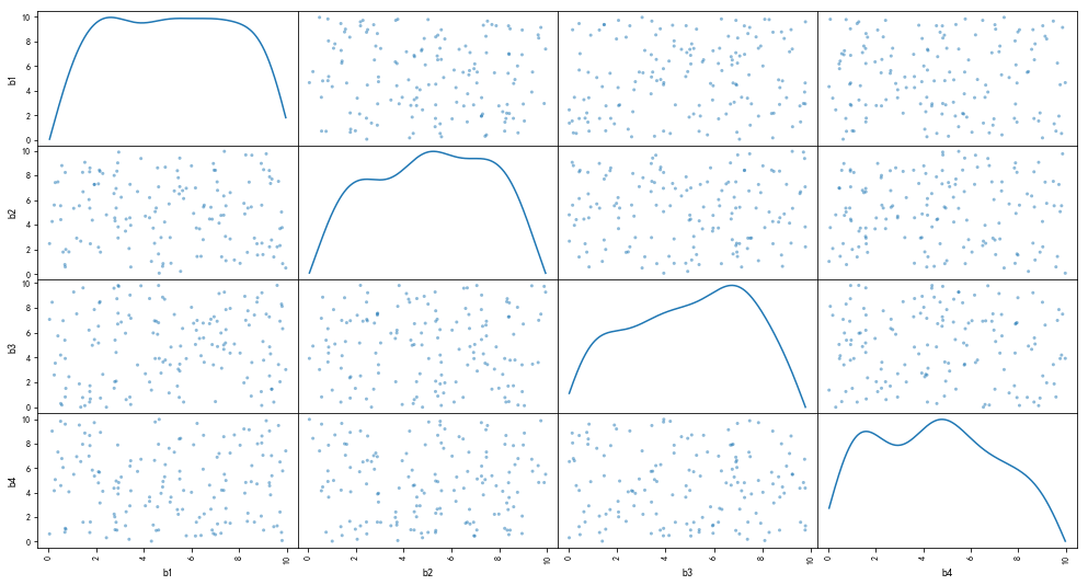
rng = np.random.RandomState(3)
xtrain = 10 * rng.rand(150,4)
ytrain = 20 + np.dot(xtrain,[1.5,2,-4,3]) + rng.rand(150)
df = pd.DataFrame(xtrain,columns = ['b1','b2','b3','b4'])
df['y'] = ytrain
pd.scatter_matrix(df[['b1','b2','b3','b4']],figsize = (17,9),
diagonal= 'kde',
alpha=0.5,range_padding=0.1)
print(df.head())
model = LinearRegression()
model.fit(df[['b1','b2','b3','b4']],df['y'])
print('斜率为:',model.coef_)
print('截距为:%.4f' % model.intercept_)
print('线性回归函数为: \n y = %.1fx1 + %.1fx2 + %.1fx3 + %.1fx4 + %.1f'
% (model.coef_[0],model.coef_[1],model.coef_[2],model.coef_[3],model.intercept_))
|
1
2
3
4
5
6
7
8
9
10
| b1 b2 b3 b4 y
0 5.507979 7.081478 2.909047 5.108276 46.364656
1 8.929470 8.962931 1.255853 2.072429 52.751766
2 0.514672 4.408098 0.298762 4.568332 42.365920
3 6.491440 2.784873 6.762549 5.908628 26.245785
4 0.239819 5.588541 2.592524 4.151012 34.592464
斜率为: [ 1.5012069 2.00117753 -4.00340344 3.00076621]
截距为:20.4865
线性回归函数为:
y = 1.5x1 + 2.0x2 + -4.0x3 + 3.0x4 + 20.5
|
线性回归模型评估
一般通过以下几个参数验证回归模型:
SSE → (和方差、误差平方和):拟合数据和原始数据对应点的误差的平方和
MSE → (均方差、方差):预测数据和原始数据对应点误差的平方和的均值
RMSE → (均方差、标准差):回归系统的拟合标准差,就是MSE的平方根
R-square(确定系数):SSR与SST的比值
SSR:预测数据与原始数据均值之差的平方和
SST:原始数据与均值之差的平方和 → SST = SSE + SSR
tips:SSE越接近0,说明模型选择和拟合越好,数据预测也越成功 ; MSE越小越好
R-square(确定系数)的取值范围[0,1],越接近1,表明方程的变量对Y的解释能力越强,这个模型对数据拟合的越好
1
2
3
4
5
6
7
8
9
10
11
12
13
14
15
16
17
18
19
20
21
22
23
24
| from sklearn import metrics
rng = np.random.RandomState(1)
xtrain = 10 * rng.rand(30)
ytrain = 8 + 4 * xtrain + rng.rand(30) * 3
model = LinearRegression()
model.fit(xtrain[:,np.newaxis],ytrain)
ytest = model.predict(xtrain[:,np.newaxis])
mse = metrics.mean_squared_error(ytrain,ytest)
rmse = np.sqrt(mse)
r2 = model.score(xtrain[:,np.newaxis],ytrain)
print('均方差MSE为:%.5f' % mse)
print('均方根RMSE为:%.5f' % rmse)
print('确定系数R-square为:%.5f' % r2)
|
1
2
3
| 均方差MSE为:0.78471
均方根RMSE为:0.88584
确定系数R-square为:0.99465
|
KNN-最邻近分类
在距离空间里,如果一个样本的最接近的k个邻居里,绝大多数属于某个类别,则该样本也属于这个类别
以下是几个KNN-最邻近分类的案例
1
2
3
4
5
6
7
8
9
10
11
12
13
14
15
16
17
18
19
20
21
22
23
24
25
26
27
28
29
30
31
32
|
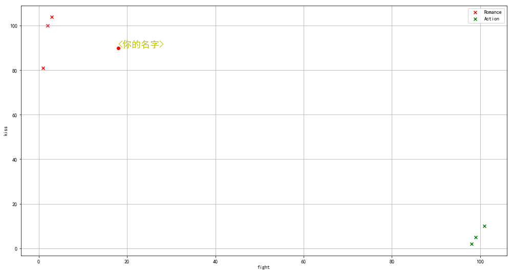
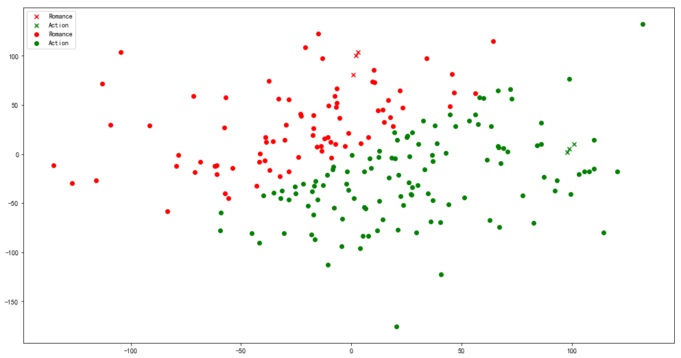
from sklearn import neighbors
data = pd.DataFrame({'name':['北京遇上西雅图','喜欢你','疯狂动物城','战狼2','力王','敢死队'],
'fight':[3,2,1,101,99,98],
'kiss':[104,100,81,10,5,2],
'type':['Romance','Romance','Romance','Action','Action','Action']})
knn = neighbors.KNeighborsClassifier()
knn.fit(data[['fight','kiss']],data['type'])
print('预测电影类型为:' , knn.predict([[18,90]]))
plt.figure(figsize = (17,9))
plt.scatter(data[data['type'] == 'Romance']['fight'],
data[data['type'] == 'Romance']['kiss'],
color = 'r',marker = 'x',label = 'Romance')
plt.scatter(data[data['type'] == 'Action']['fight'],
data[data['type'] == 'Action']['kiss'],
color = 'g',marker = 'x',label = 'Action')
plt.grid()
plt.legend()
plt.scatter(18,90,color = 'r',marker = 'o',label = 'Romance')
plt.ylabel('kiss')
plt.xlabel('fight')
plt.text(18,90,'<你的名字>',color = 'y',fontsize = 18)
|
1
2
3
4
5
6
7
8
9
10
11
12
13
14
15
16
17
18
19
20
21
22
23
24
|
data2 = pd.DataFrame(np.random.randn(200,2)*50,columns=['fight','kiss'])
data2['typetest'] = knn.predict(data2)
data2.head()
plt.figure(figsize = (17,9))
plt.scatter(data[data['type'] == 'Romance']['fight'],
data[data['type'] == 'Romance']['kiss'],
color = 'r',marker = 'x',label = 'Romance')
plt.scatter(data[data['type'] == 'Action']['fight'],
data[data['type'] == 'Action']['kiss'],
color = 'g',marker = 'x',label = 'Action')
plt.grid()
plt.legend()
plt.scatter(data2[data2['typetest'] == 'Romance']['fight'],
data2[data2['typetest'] == 'Romance']['kiss'],
color = 'r',marker = 'o',label = 'Romance')
plt.scatter(data2[data2['typetest'] == 'Action']['fight'],
data2[data2['typetest'] == 'Action']['kiss'],
color = 'g',marker = 'o',label = 'Action')
plt.grid()
plt.legend()
|
1
2
3
4
5
6
7
8
9
10
11
12
13
14
15
16
17
18
19
20
21
22
23
24
25
26
27
28
|
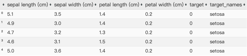
from sklearn import datasets
iris = datasets.load_iris()
print(iris.keys())
print('数据长度为:%i条' % len(iris['data']))
print(iris.feature_names)
print(iris.target_names)
data = pd.DataFrame(iris.data,columns= iris.feature_names)
data['target'] = iris.target
ty = pd.DataFrame({'target':[0,1,2],
'target_names':iris.target_names})
df = pd.merge(data,ty,on = 'target')
knn = neighbors.KNeighborsClassifier()
knn.fit(iris.data,iris.target)
pre_data = knn.predict([[0.2,0.1,0.3,0.4]])
print(pre_data)
df.head()
|
1
2
3
4
| dict_keys(['data', 'target', 'target_names', 'DESCR', 'feature_names', 'filename'])
数据长度为:150条
['sepal length (cm)', 'sepal width (cm)', 'petal length (cm)', 'petal width (cm)']
['setosa' 'versicolor' 'virginica']
|
PCA主成分分析
通过线性变换将原始数据变换为一组各维度线性无关的表示,用于提取数据的主要特征分类
1
2
3
4
5
6
7
8
9
10
11
12
13
14
15
16
17
18
|
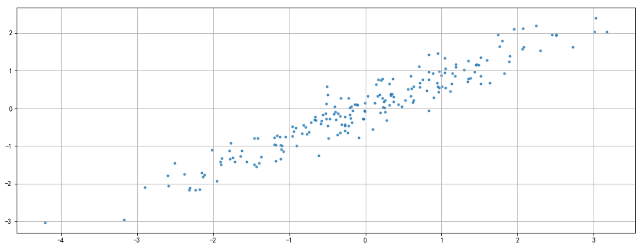
rng = np.random.RandomState(8)
data = np.dot(rng.rand(2,2),rng.randn(2,200)).T
df = pd.DataFrame({'X1':data[:,0],
'X2':data[:,1]})
print(df.head())
print(df.shape)
plt.figure(figsize = (16,6))
plt.scatter(df['X1'],df['X2'],alpha=0.7,marker = '.')
plt.axis('auto')
plt.grid()
|
1
2
3
4
5
6
7
| X1 X2
0 -1.174787 -1.404131
1 -1.374449 -1.294660
2 -2.316007 -2.166109
3 0.947847 1.460480
4 1.762375 1.640622
(200, 2)
|
1
2
3
4
5
6
7
8
9
10
11
12
13
14
15
16
17
18
19
20
21
22
23
24
25
26
27
28
29
30
31
32
33
34
35
36
37
38
39
40
41
42
43
44
45
46
|
"""
PCA参数:('n_components=None', 'copy=True', 'whiten=False', "svd_solver='auto'",'tol=0.0', "iterated_power='auto'", 'random_state=None')
"""
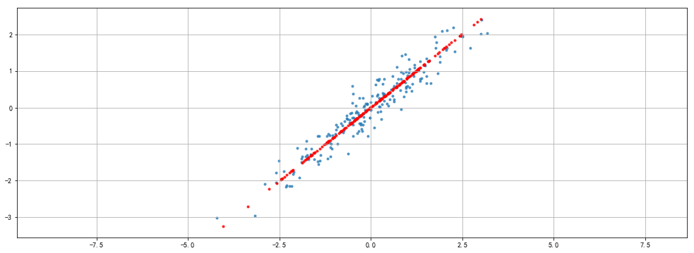
from sklearn.decomposition import PCA
pca = PCA(n_components= 1)
pca.fit(df)
print(pca.explained_variance_)
print(pca.components_)
print(pca.n_components)
x_pca = pca.transform(df)
x_new = pca.inverse_transform(x_pca)
print('original shape:',df.shape)
print('transformd shape:',x_pca.shape)
print(x_pca[:5])
print('-------------------------------')
plt.figure(figsize = (17,6))
plt.scatter(df['X1'],df['X2'],alpha=0.7,marker = '.')
plt.scatter(x_new[:,0],x_new[:,1],alpha=0.8,marker = '.',color = 'r')
plt.axis('equal')
plt.grid()
|
1
2
3
4
5
6
7
8
9
10
11
| [2.79699086]
[[-0.7788006 -0.62727158]]
1
original shape: (200, 2)
transformd shape: (200, 1)
[[ 1.77885258]
[ 1.8656813 ]
[ 3.14560277]
[-1.67114513]
[-2.41849842]]
-------------------------------
|
1
2
3
4
5
6
7
8
9
10
11
12
13
14
15
16
17
18
19
20
21
22
23
24
25
26
27
28
29
30
31
32
33
34
35
36
37
|
from sklearn.datasets import load_digits
digits = load_digits()
print(digits.keys())
print('数据长度为:%i条' % len(digits['data']))
print('数据形状为:%i条' , digits.data.shape)
print(digits.data[:2])
print('---------------------------------------')
pca = PCA(n_components= 2)
pca.fit(digits.data)
prj = pca.transform(digits.data)
print('original shape:',digits.data.shape)
print('transformd shape:',prj.shape)
print(prj[:5])
print('---------------------------------------')
print(pca.explained_variance_)
print('--------------------------------------')
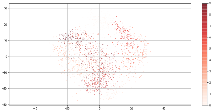
plt.figure(figsize = (13,6))
plt.scatter(prj[:,0],prj[:,1],
c = digits.target,edgecolor = 'none',alpha = 0.6,
cmap = 'Reds',s = 5)
plt.axis('equal')
plt.grid()
plt.colorbar()
|
1
2
3
4
5
6
7
8
9
10
11
12
13
14
15
16
| dict_keys(['data', 'target', 'target_names', 'images', 'DESCR'])
数据长度为:1797条
数据形状为:%i条 (1797, 64)
[[ 0. 0. 5. 13. 9. 1. 0. 0. 0. 0. 13. 15. 10. 15. 5. 0. 0. 3.
15. 2. 0. 11. 8. 0. 0. 4. 12. 0. 0. 8. 8. 0. 0. 5. 8. 0.
0. 9. 8. 0. 0. 4. 11. 0. 1. 12. 7. 0. 0. 2. 14. 5. 10. 12.
0. 0. 0. 0. 6. 13. 10. 0. 0. 0.]
[ 0. 0. 0. 12. 13. 5. 0. 0. 0. 0. 0. 11. 16. 9. 0. 0. 0. 0.
3. 15. 16. 6. 0. 0. 0. 7. 15. 16. 16. 2. 0. 0. 0. 0. 1. 16.
16. 3. 0. 0. 0. 0. 1. 16. 16. 6. 0. 0. 0. 0. 1. 16. 16. 6.
0. 0. 0. 0. 0. 11. 16. 10. 0. 0.]]
---------------------------------------
original shape: (1797, 64)
transformd shape: (1797, 2)
---------------------------------------
[179.0069301 163.71774688]
|
1
2
3
4
5
6
7
8
9
10
11
12
13
14
15
16
17
18
19
20
21
|
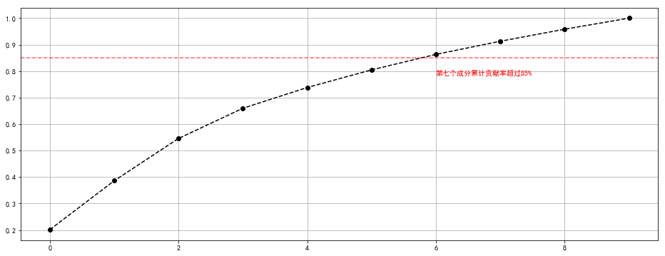
pca = PCA(n_components= 10)
pca.fit(digits.data)
prj = pca.transform(digits.data)
print('original shape:',digits.data.shape)
print('transformd shape:',prj.shape)
prj[:5]
print('---------------------------------------')
s = pca.explained_variance_
c_s = pd.DataFrame({'b':s,
'b_sum':s.cumsum() / s.sum()})
c_s['b_sum'].plot(style = '--ko',figsize = (16,6))
plt.axhline(0.85,color = 'r',linestyle = '--',alpha = 0.6)
plt.text(6,c_s['b_sum'].iloc[6] - 0.08,'第七个成分累计贡献率超过85%',color = 'r')
plt.grid()
|
1
2
3
| original shape: (1797, 64)
transformd shape: (1797, 10)
---------------------------------------
|
K-means聚类
聚类分析:是一种将研究对象分为相对同质的群组的统计分析技术
将观测对象的群体按照相似性和相异性进行不同群组的划分,划分后每个群组内部各对象相似度很高, 而不同群组之间的对象彼此相异度很高
聚类分析后会产生一组集合,主要用于降维
K均值算法实现逻辑:
K均值算法需要输入待聚类的数据和欲聚类的簇数K
1、随机生成k个初始点作为质心
2、将数据集中的数据按照距离质心的远近分到各个簇中
3、将各个簇中的数据求平均值,作为新的质心,重复上一步,直到所有的簇不再改变
1
2
3
4
5
6
7
8
9
10
11
12
13
14
15
16
17
18
19
20
21
22
23
24
25
26
27
28
29
30
31
32
33
34
35
36
37
38
39
40
41
42
43
|
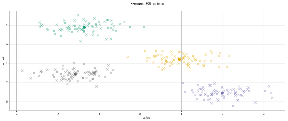
from sklearn.datasets.samples_generator import make_blobs
x,y_ture = make_blobs(n_samples= 300,
centers= 4,
cluster_std= 0.5,
random_state= 0)
"""
参数解析:
n_samples : 待生成的样本总数
centers : 类别数
cluster_std : 每个类别的方差,如多类数据不同方差,可设置为区间类似[1.0,3.0]这里针对2类数据
random_state : 随机数种子
x → 生成数据值 , y → 生成数据对应的类别标签
"""
print(x[:5])
print(y_ture[:5])
print('-------------------------------------')
from sklearn.cluster import KMeans
kmeans = KMeans(n_clusters= 4)
kmeans.fit(x)
y_kmeans = kmeans.predict(x)
centroids = kmeans.cluster_centers_
plt.figure(figsize = (16,6))
plt.scatter(x[:,0],x[:,1],c = y_kmeans,cmap = 'Dark2',s = 50,alpha = 0.5,marker = 'x')
plt.scatter(centroids[:,0],centroids[:,1],c = [0,1,2,3],cmap = 'Dark2',s = 70,marker = 'o')
plt.title('K-means 300 points\n')
plt.xlabel('value1')
plt.ylabel('value2')
plt.grid()
|
1
2
3
4
5
6
7
| [[ 1.03992529 1.92991009]
[-1.38609104 7.48059603]
[ 1.12538917 4.96698028]
[-1.05688956 7.81833888]
[ 1.4020041 1.726729 ]]
[1 3 0 3 1]
-------------------------------------
|
写在最后
以上是在数据分析过程中常用到的几种基本算法,可以快速的定位数据分析的方向和数据类型。其中线性回归和主成分分析会更常见一下,这份笔记也是为了随时翻阅而记录,欢迎指正,感谢阅读~