Catalogue
摘要
数据分布可视化图表绘制,包括直方图、密度图、柱状图、折线图的一些实例~
写在前面
今天主要聊聊关于数据分布情况的可视化所用到的一部分图表
- 什么是分布数据:定量化的数据,而非定性化的数据,一般指只是数值的数据
- 什么是分布数据可视化:查看数据分布情况以及数据分布统计时做的图表可视化
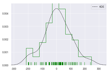
直方图
直方图主要反映数据分布情况
导入模块
1 | import pandas as pd |
设置绘图风格
1 | # 设置风格、尺度 |
绘制直方图-1
1 | # 创建数据 |
<matplotlib.legend.Legend at 0xf049090>
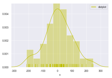
绘制直方图-2
1 | sns.distplot(s,rug = True, |
<matplotlib.axes._subplots.AxesSubplot at 0xf4fc9f0>
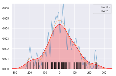
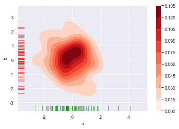
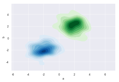
密度图
密度图与直方图用途一致,都是用于反映数据的分布情况,可视化效果炫酷一些,看个人喜好选择
单样本密度图
1 | # 密度图 - kdeplot() |
<matplotlib.axes._subplots.AxesSubplot at 0xca6b90>
多样本密度图-1
1 | # 密度图 - 两个样本数据密度分布图 |
<matplotlib.axes._subplots.AxesSubplot at 0x10bf0170>
多样本密度图-2
1 | # 密度图 - 两个样本数据密度分布 |
<matplotlib.axes._subplots.AxesSubplot at 0x11147bf0>
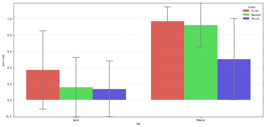
柱状图
barplot :绘制柱状图
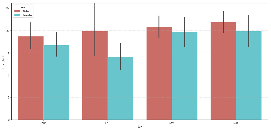
分布统计柱状图
1 | # 置信区间:样本均值 + 抽样误差 |
柱状图拆分
1 | # 二次拆分 |
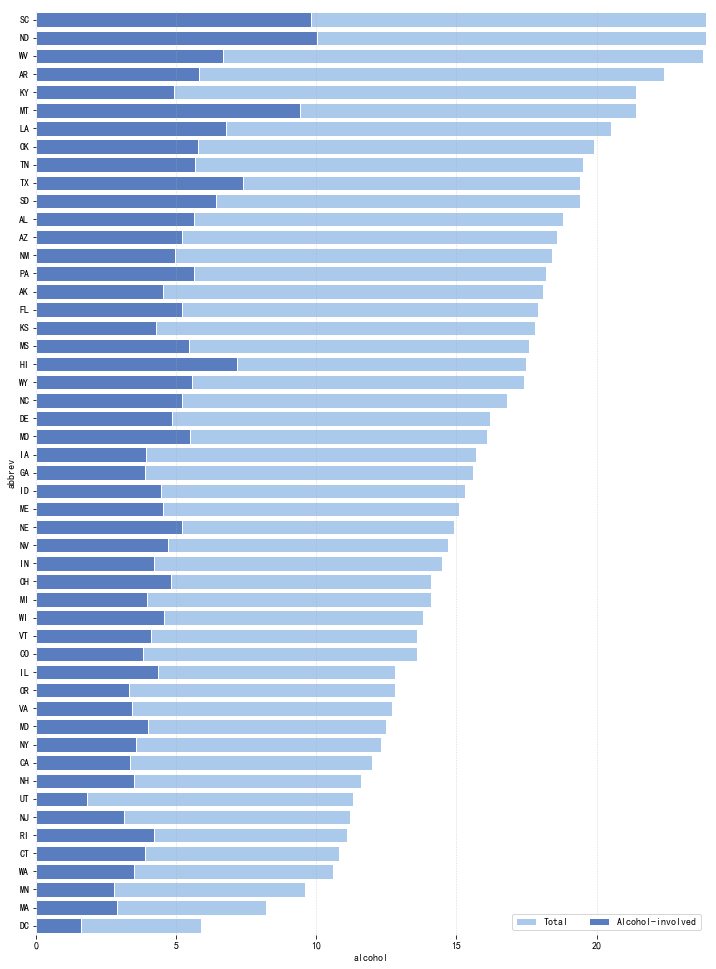
实例应用
1 | # 例子 |
1 | total speeding alcohol not_distracted no_previous ins_premium \ |
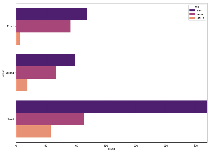
计数柱状图
1 | # countplot() - 计数柱状图 |
1 | <matplotlib.axes._subplots.AxesSubplot at 0x15dc5cb0> |
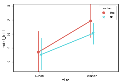
折线图
pointplot:绘制折线图,置信区间的直观显示
1 | # pointplot() - 折线图 - 置信区间估计 |
1 | time smoker |
总结
以上为研究数据分布时的可视化图表中较为常用的几种图表展示,看起来不难,实际上需要注意的是对图表背后数据结构的理解,图表可视化只是一种手段,真正重心还是在能否真正理解背后的数据逻辑,感谢阅读~
本文版权归作者所有,欢迎转载,转载请注明出处和链接来源。